

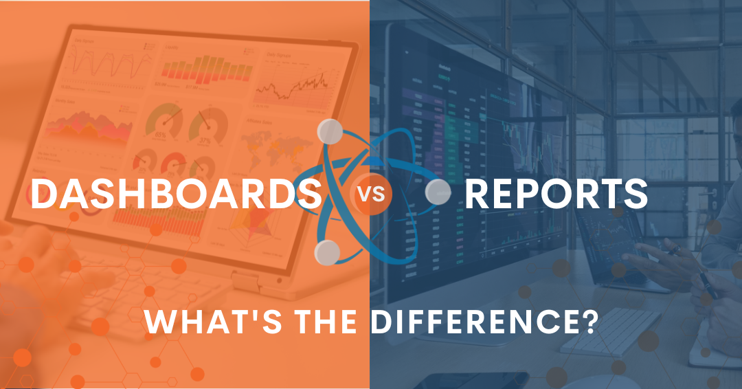
When you hear people talk about data visualization you often hear the terms “dashboard” and “report” used interchangeably — but is this correct? Are they interchangeable terms? The short answer is no. They are actually quite different in how they display information and data: but to put it simply, dashboards offer dynamic information; reports offer static data.
Understanding the differences between a data dashboard and a report, the unique attributes of each, and how they can be used to achieve customer advocacy will help your B2B company maximize profitability. It’s all about the data!
What is a Dashboard?
Dashboards are dynamic data visualization tools customized to show specific data, metrics, and key performance indicators (KPIs) in real time. Because dashboards are “live,” the data is updated in real time, and the information displayed can change from hour to hour and even minute to minute. While viewing current data, dashboards also allow you to display previous period information and switch easily between multiple views and breakdowns.
Due to their capacity for customization, dashboards can be as specific or as broad as needed, and your B2B company can utilize multiple dashboards to organize your data in the most efficient, analytical way.
How Are Dashboards Used?
Dashboards are used to view information regularly and closer to real-time when compared to static, historical reports. They also allow for the viewing of metrics by different channels, modifiers, and purposes. Dashboards are very useful for tactical decision-making due to their real-time provision of data and their ability to provide up-to-date trend analysis for a variety of uses.
While dashboards were once associated with data scientists and engineers helping C-level executives keep an eye on their most valued metrics, the recent emergence of fully managed KPI dashboards means that every department and individual within your company can have access to data that will help them do their jobs better and break down silos between departments and people.
What Is a Report?
As stated above, reports are static documents that communicate historical data from a moment in time, usually in text and table form with some basic charts or graphs. They are typically organized to emphasize particular raw numbers or pertinent data sets. Reports are generally distributed to company stakeholders at specific intervals (monthly, quarterly, yearly). Because of their static nature, reports enable their creators to use carefully selected data to tell a narrative or data story about the company’s performance.
Stakeholders who don’t have access to unfiltered data and analytics tools should always be conscious of what data may have been excluded from a report, whether intentionally or not. They should also remain aware that reports contain past data that can’t be updated in real-time and represent a portion of all available data sets without the ability to filter or sort through them based on situational needs.
How Are Reports Used?
Reports are great for showing recapped information or controlling the message of the data. Often reports are printed but they can also be viewed digitally. A great example of a true report would be your company’s Annual Report. The Annual Report shows an overview of your company’s performance over the previous fiscal year, breaking down information as necessary. It is designed to tell the overall story of your company.
Often, data from a dashboard is compiled into a report, which can present a snapshot of things like top-line revenue growth, bottom-line operational costs, customer journey engagement, and operational efficiency in both your business processes and people operations.
Should I Use a Dashboard or Report?
The decision to use a dashboard or a report depends on the circumstances of what you are trying to accomplish and your data needs. We find it is nearly impossible to operate a business proactively rather than reactively and reach consistent profitability without the data visualization of a real-time dashboard.
Because dashboards are used to measure virtually any type or number of data points, they are very effective for monitoring specific KPIs and any dynamic information.
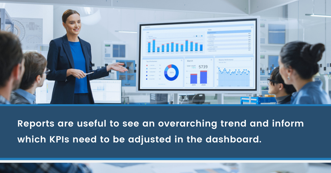
Compare that with reports, which are useful for looking at things with a broader scope and hand-picking which historic information you want to apply in telling a specific narrative.
At the end of the day, you don’t need to limit yourself to just one of these options: dashboards can be used to generate compelling data reports, and reports can be used to inform which metrics and KPIs a dashboard should be monitoring. The EOS process is a great example of an efficient business system that relies on both dashboards and reports.
Example of Dashboard KPIs
Listening to your customers and creating a customer advocacy plan based on measurable data can increase revenue operations with consistency. So, which dashboard KPIs would you use to do this?
Here are some examples:
- How many customers are returning customers?
- What is the trend year-over-year (versus sheer volume)?
- How many customers are you losing?
- Why did customers leave or stop buying?
- How often are your existing customers referring new customers?
- What is your close rate on those referred customers?
- What do your customers like about you (quantify things like reliable, fast, less expensive)?
- How many steps from initial contact to conversion?
- How long does it take for clients to receive your goods or services?
- What are your customer acquisition costs?
- And more!
From these real-time dashboard metrics, you can run reports and make changes based on what the data is telling you. Be sure to read this blog for detailed information: Data Surrounding Customer Advocacy.
.png?width=1200&height=628&name=Atomic%20Revenue%20Blog%20Headers%20and%20Graphics%20(58).png)
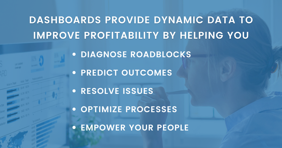
Dashboards & Reports Help You Make Proactive Impactful Decisions
At Atomic Revenue, we help B2B clients find the roadblocks to profitability by diagnosing what is working and what is not, then implementing revenue operations solutions. Almost every time we perform a diagnostics, we find there is no data being tracked for really important KPIs or the data that is being tracked is not complete or meaningful. Without great data, you cannot make impactful decisions.
Only when you use a data dashboard and run reports can you be proactive enough to create true customer advocacy, which leads to profitability.
Talk to Atomic Revenue’s Data Experts with No Obligation
Have more questions about the difference between dashboards and reports and how your organization should be using each for maximum impact? Schedule a call with Atomic Revenue’s data experts today. There is no obligation — we love talking about all things data!

About the Author
Liz Campbell, Chief Data Advisor at Atomic Revenue, is dedicated to developing technologies that make business data more accessible and comprehensible. Liz helps companies align their internal systems to make sure they're capturing the right data for their unique business needs, and then automates the reporting process to ensure each business has insight into the data and analysis they need to truly understand their revenue generation process.


