

When starting a business or refreshing your current business image, your logo portrays as much as anything you can say or do – especially when it comes to first impressions. You know what they say – you only get one chance – so make it memorable with a logo that depicts your message, brand, and your style.
Designing Logo Tips
Here is a guide for things to consider as you embark on choosing a logo and launching your business brand to new heights.
Keep It Simple
What do you want your logo to say about you? About what you offer? When designing a logo, people often have numerous ideas of elements they’d like to include, especially if their business offers several different services they want incorporated into the logo. This is generally bad practice – it can crowd the logo and distract from the text. Instead, it should be the job of the graphic designer to summarize what the brand offers in 2-3 elements. If need be, the business’s brand can be elaborated on later with supplemental iconography in the overall branding. This logo for St. Louis business consultant Mary Kutheis, MCK Coaching and Training, is a great example.
![]()
Color Matters
It is important to consider color theory in your brand, but also don’t let it limit you. That said, skipping neon colors and bright yellows is good practice as those colors may not print well. Because of the range of where the logo will be placed, considering the RGB and CMYK color-space is imperative. Be careful not to use another brand’s color scheme, as it may confuse people. It is usually a good idea to stick with two colors, three max. As for gradients, have alternative designs without them as they will not print well on certain items and can be limiting moving forward. Again, it is the job of the graphic designer to know what will print well on all forms of printed materials like posters, shirts, and billboards, as well as on digital marketing, and in black and white.
How Will the Logo Look Far Away?
There are a lot of great logos that are best viewed close-up. How “great” are they, though, if someone has your logo embroidered on their shirt … is it readable? What if you have your logo on a sign, a tradeshow booth, or a billboard far away? Before you go with a logo, hold the logo far away from you and consider if it will still translate from a distance.
Think Taboo … What Would Freud Say?
Unfortunately, this must be considered before finalizing any brand. It is a good rule of thumb to think, “What would Freud say?” before opting for a certain design. If there are certain elements that could be misconstrued, nix them. For example, long lines with round caps could be dangerous territory, as well as layers that open to a thin slit.
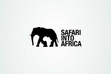
Consider the Negative Space
When you’re not reading the text or looking at the design features, check out what’s happening in the space between the elements – do you see any other designs? Maybe there’s an opportunity to place something in the white space?
 |
 |
Logos Don’t Have to Summarize What the Brand Does
A computer company doesn’t necessarily have to have a computer as their logo. Much like a beer brand doesn’t have to have a beer as their logo. Think of other features of the brand – the tone (playful? colorful?), the location, the future … lots of other features of the brand can also influence what direction the design takes. Perhaps the brand’s packaging is going to be very involved, or the logo will be placed on busy surfaces. In that case, it’s best to opt for something more simplistic.
Keep the Elements Relevant
If the brand is a legal firm, it’s okay to use fun copy in the brand, but skip the smiley faces. If the brand is a restaurant, it’s generally good practice to stay away from groggy colors that may evoke a sense of uncleanliness – so no brown/green combos. If the brand is science-based, stay away from religious iconography. Be sensitive to cultural appropriation.
The Font Says a Lot
Don’t just go with Helvetica or Calibri. Also, skip Papyrus. It’s 2020 – there are a ton of great fonts out there these days. It is worth shelling out for a license if it means you won’t have competitors using your font. If you’re on the cheap, don’t worry – there are thousands of affordable fonts that will suit your project rather than the ones that are auto-installed on your computer. You can also integrate elements of the design into the negative space of your chosen font and letter forms.
If you’re trying to look modern, sans serif may be for you. Want to establish that your brand has been around and knows tradition? Serif may convey that. Typography can send a powerful message without simply relying on iconic images. In the following logo, the pastels and choice of font were carefully tailored to fit his “bedroom pop” band.
Design A Timeless Logo That Reveals Your Brand
As logos go, there are a lot of really great ones out there and just as many confusing, hard to read logos. When designing yours, think timeless, simple, and brand worthy. Step back and think about how what you’re trying to convey will look in and on every type of print and online marketing medium; up close and far away. Remember, the ultimate goal is to build a strong brand and increase revenue – a logo can make or break the first impression of your business and the brand recognition needed to grow.
When you're ready to design or refresh your logo, it’s best to leave the design work to a professional graphic designer who has expertise in this area – branding is mostly a psychological endeavor and designers are schooled in how certain colors, layouts, and even fonts will affect emotions.
Have questions or would you like to learn more? Contact Atomic Revenue – our expert designers can help! (314) 439-1280
 About Adrienne Luther
Adrienne is an Atomic Revenue designer who also owns AdrienneLuther designs. She works with all size businesses and entrepreneurs and has collaborated on nearly 50 brands, overseeing brand development, logos, color schemes, search engine optimization, and social media strategies. She loves getting to know aspiring brands and helping them score the design appeal they need to stay consistent and grounded. Adrienne is also an artist with talent in many mediums, including digital portraits and chalk art.


