As a young graphic designer, I came up in the agency world as many of us do. I worked on typical projects such as packaging, collateral, websites, branding, etc. without much involvement in the "why" of what was being designed. My main goal was to “impress my boss” and “prove my worth” by creating aesthetically pleasing work.
Fast forward several years, and I find myself in an unusual space as Brand Manager for a revenue operations firm. What I have learned here changes my perspective on the power of design as I strive to make very functional sales materials beautiful and always with a purpose.
As humans, we want to be purposeful. As a “Graphic Designer,” my purpose is ultimately a “behind-the-scenes” salesperson. Yes, I make things “pretty" and solve problems by visually communicating ideas and information, but in the end, it’s to help the client sell something. By keeping this mindset at the forefront of my work, I am more efficient and useful to our clients’ needs.
At Atomic Revenue, I have learned to focus on the content, the message, and the purpose of a material than design to fit those specifications. I receive things that you could call ugly and in raw form thinking to myself "Wow, what in the world?!" but then, as I understand the purpose, we can collaborate with sales professionals to make a beautiful marketing piece that actually compels interest and educates a prospect to make a buying decision which is the whole purpose of what we do.
Here are some of the key projects that I have and continue to work on and some tips to consider function beyond beauty:
1. Sales Collateral
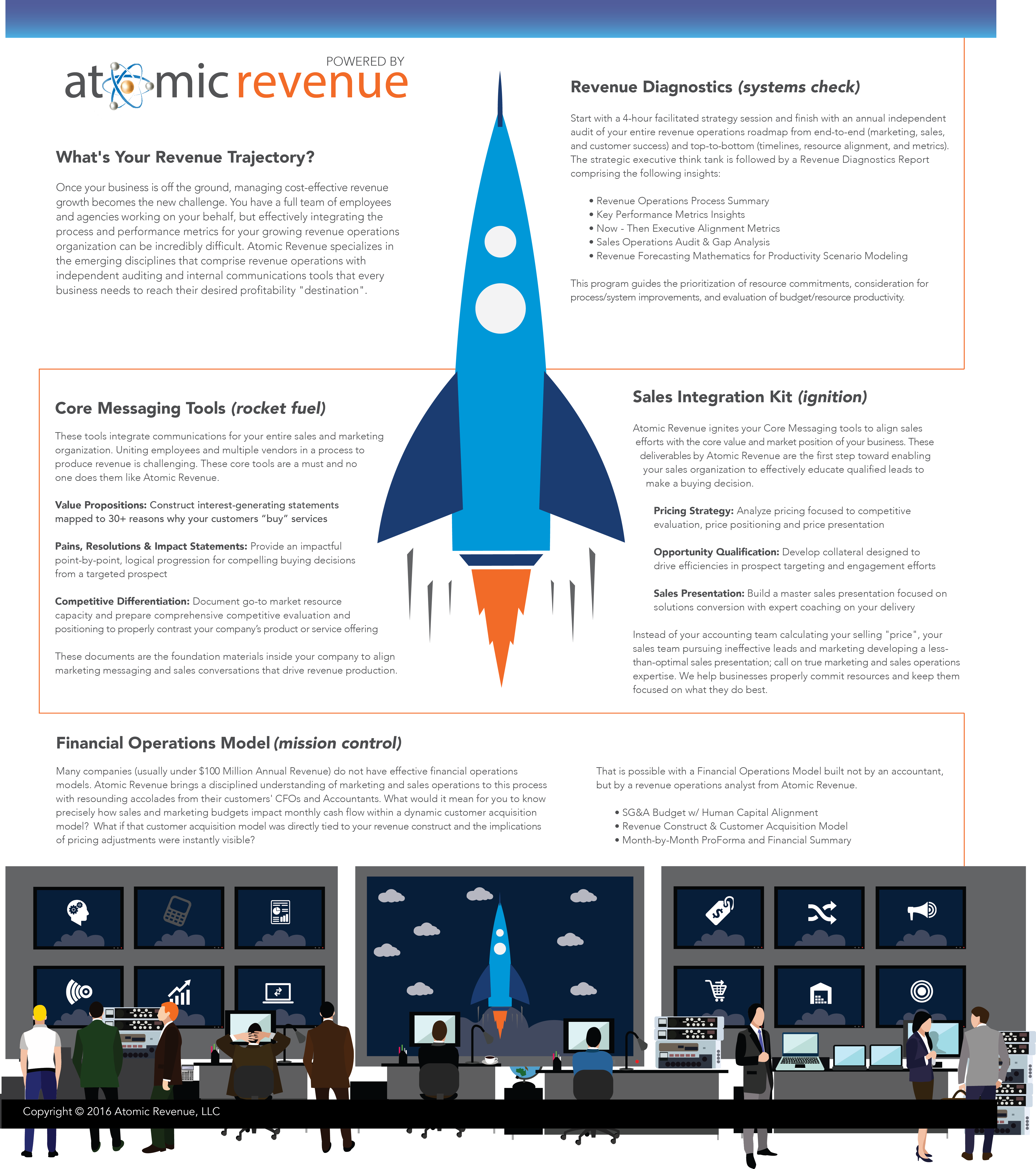
This illustrates a complex topic for mainstream understanding by comparing each of the services that Atomic Revenue provides to a function related to a rocket-ship used in space exploration. Comparing complex services to subjects humans can easily grasp is a technique I’ve adopted at Atomic Revenue. This particular graphic explains revenue diagnostics, core messaging tools, sales integration kits, and financial operations models.
2. Corporate Branding
With our client, Centerprism, a full-spectrum ERP, we completely rebranded their company and created all new sales collateral with a memorable brand tied to the software solution that educates buyers on the key features and benefits of the software. There was a heavy load of content given to create these pieces and the art form came in reducing and finessing the content as much as possible so that it was very clear to the client. Less is more.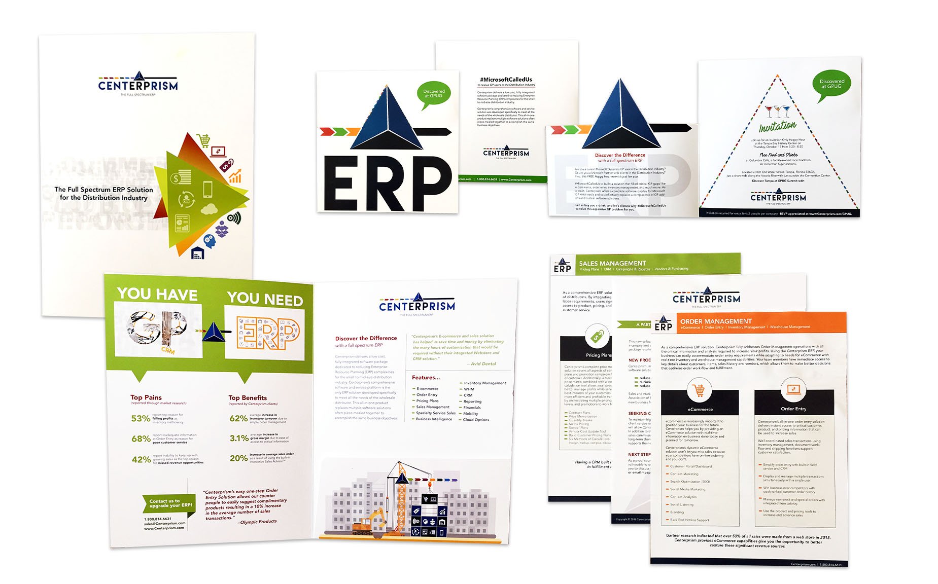
3. Infographics for Blog and Social Media
Infographics always look much easier than they are to create. Taking a service and putting it into a cohesive and functional image that conveys a clear need makes it an easier to sell to our clients. This client, OMiga, acts as the back-office for companies managing their finances, accounting, human resources, bookkeeping, and payroll.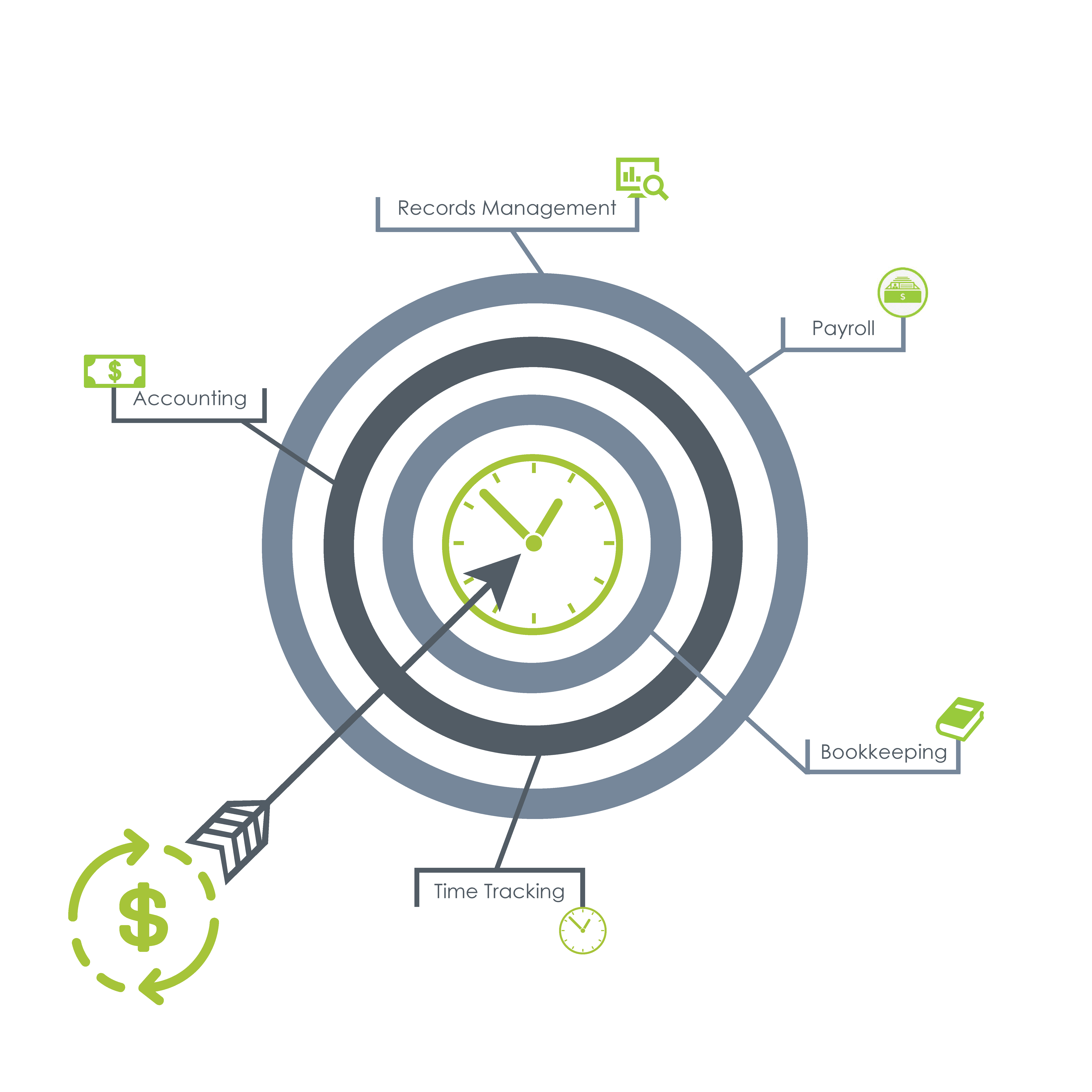
4. Brochures and Internal Collateral
For Our Urgent Care, we created a sales and training program entitled the "The Our Way Guide." This internal collateral is used with current employees to educate them on their important role in marketing and sales and the ultimate success of this string of urgent care facilities in the St. Louis area.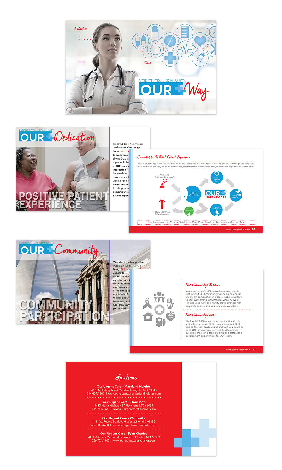
The brain is complicated and we live in a world where technology is advancing faster than we can even think. There are many intricate systems to help accomplish our goals and big data analytics tracking our every decision. However, in this complicated world, we simply yearn for clarity, function, and purpose. This is a perspective that I’ve adopted on my journey as a designer and carry throughout my work at Atomic Revenue.

